


What would you do?
Last week I posted this stack of solids in my Instagram feed and asked which color you thought I was using as a background fabric color.


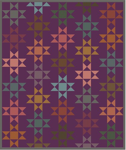


There were so many great ideas! A couple of the guesses were correct, but I loved seeing the responses even if they were right. These are mockups of several of the colors that were guessed.
Aren't those great? I'm shocking myself by loving the black one the most. I'm usually too chicken to try something that bold.
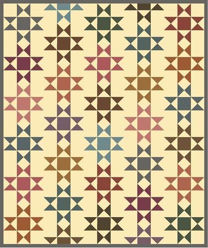
Ok, do you want to see the color I actually used?
It's definitely less bold, but I love how sweet it is. The color is Art Gallery Pure Solids in Sweet Macadamia and I love it SO MUCH. I'm in the middle of piecing the blocks right now and am definitely happy with my choice, even though these other colors would have been great. This is my next pattern (The Zelda Quilt!) and it will be available later this month.
Which background fabric is your favorite?
Susan on
I love the magenta background, I see the blocks moving forward and backward. The background almost seems to be shaded.
Kathy on
Henry needs to do his own essay.
henry on
do my essay
Lisa on
The dark blue or black really makes the stars pop!
Maryanne Richards on
I love the purple best with yellow second (though never having used yellow before). Though they are all beautiful options. I recently used solids very similar to yours and chose a bold Kaffe rolled paper print as my background
Maggie Ptakowski on
All are stunning… but- love the purple! I gravitate to Ed’s the bright jewel tones!
Laura B on
Love the navy blue!
Francine Pollock on
Definitely the black. Love the Amish feel.
Kim Domingue on
The black is fabulous closely followed by the yellow, both bold and eye catching. Those two backgrounds, seem to me, to focus attention on the patterns created by the solid colors and create a stunning simplicity. The black forcefully reminds me of Amish quilting.
Connie on
a real game changer to see all of them. I guess my first like was the purple. Thanks
Deb on
I can see how you would choose the Macadamia – it’s beautiful! I would choose the navy or black myself so the colors really pop & to have a quilt that is totally different. So many of my quilts are white or cream based scrappy backgrounds.
Wendy Giusti on
I lean to the darker backgrounds so the navy is my favorite followed by the black and purple.